Embark // Data submission portal
Prompt
In order to get a payload approved to fly to the ISS, payload developers (PDs) must interact with over 30 internal NASA systems, many with their own unique UI, URLs, passwords, processes, and administrators. This is a herculean task even for those most well-versed in the process, and a daunting barrier to entry for new users. If the ISS is to achieve its goal of being a true commercial laboratory (in space!), a more user-friendly process must be introduced. An interdisciplinary team of designers and engineers was charged with creating a system that would allow users to submit all of their information from a single website, eliminating rote duplication of data among systems while guiding the user through the approval process. The Ames HCI team was tasked with conducting initial user research and coming up with the final UI solution. As a parallel effort, other teams within NASA would work on simplifying the underlying Science, Technology, and Engineering (ST&E) process that payload developers must follow.
Each square represents a unique task in just one of several phases involved in the ST&E Process that Embark supports. There's a LOT of process.
Understanding
With such a huge potential space for investigation, we chose to begin by meeting with as many types of users as possible – Internal NASA scientists, university students, major contractors, government labs, and the like, to hear about their troubles with getting their payloads approved. The investigation ended up spanning 6 states, with insights ranging from the very specific “one particular button in this system is terrible (get a real quote)” to the very specific “This person makes it hard to get things done (get a real quote).” Research efforts were specifically targeted at users’ issues rather than processes, as information regarding those 30-odd systems’ processes was to be summarized by another NASA team. In the end, we came away with insights validating a single-system approach, and pointed us towards a potential UI to address the matter. These included…- Working across systems creates a cumulative impact on PD performance
- Systems don't share data, resulting in rote duplication of information
- Individual systems have many inefficiencies in data input and identification
- Processes are often too rigid to adapt to the realities of payload development
- PDs lack complete mental model of process flow, schedules, and needed deliverables
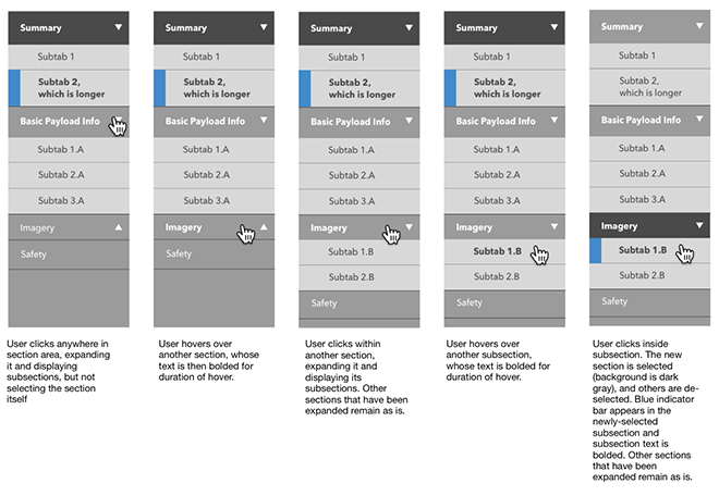
Breaking down Embark's initial navigation bar, developed with expandability in mind
Solution
Initial designs were presented to a group of six companies, each representative of a different group of PD users (Internal NASA, Commercial businesses, etc). Core concepts like saving draft data, navigating between the system's various modes, and summarizing progress were tackled first, with users being presented several options for each. Once a consensus was established among the communities, the process was repeated with more specific interactions, such as attaching documents, cloning payloads, and entering groups of data.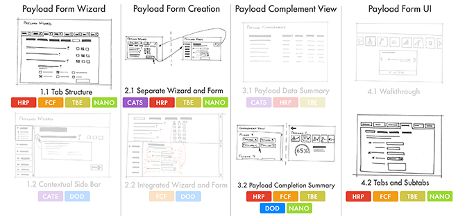
Design preference among disparate user communities was taken into account
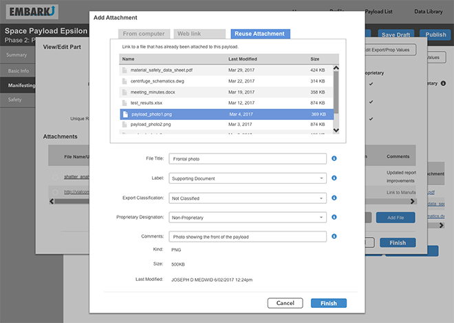
Attachment synchronization among systems – one of Embark's many features
It soon became clear that an in-depth technical solution would have to be conceived of hand-in-hand with the UI. In order to allow the users to have their single point of entry, data would then have to be shared with the dozens of other locations where it was needed. This technical framework informed a flexible UI that would enable users to provide data for any system, save it as a draft, and publish it to the “authoritative source” system when desired. Because the complete scope of data to be included in the system was not yet specified (and could potentially include upwards of 10,000 data fields), we created flexible navigation and data entry screens that would be able to meet the needs of whatever came at the users. Individual features, such as notifications, attachments, configuration management, and context-sensitive help documentation were also developed prior to the final data's availability.
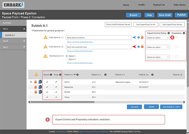
At this point, the interface had accrued too much functionality
Rethinking the Solution
As the project matured, additional needs were discovered, and additional functionality was included in the project's mandatory requirements. The design team begrudgingly admitted that perhaps the initial scope was too ambitious for a successful stage one release. Going back to the original research, we devised a scaled-down version that could serve as a short turnover deliverable that would help users with their fundamental issues (sharing the most commonly-used data and guiding them through the overall process) while serving as a foundation for future development.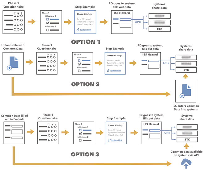
Several minimum viable solutions were offered to serve as a starting point for future iteration
Results
Examining what was achievable in the project's remaining time frame, the final version of the Embark UI was envisioned as a jumping-off point for access to other systems, rather than a conglomeration of those systems' data. From Embark, PDs could see how many tasks were expected of them in the near term, quickly navigate to the systems where that data was to be entered, and mark that work as complete. To ease the burden of duplicate data, the most common information about a payload (its name, points of contact, scientific description, and the like) could also be entered and shared with external systems.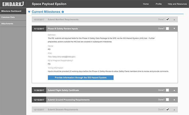
The final interface focused on guiding users through each step of the process flow rather than directly entering data